The real title of this article is: Lots of the Love for the Wiz/Zero Love for 0 and Ayers. (but that just doesn't roll of the tongue as nicely).

Wow. The Wiz have gone 20-17 so far this season, 17-12 since Gil's knee put an indefinite hold on his season.
This is far cry from
where I thought we would be, not even factoring in the thought that Gil wouldn't be playing. In that entry, we had just started 0-3, on our way to 0-5, before somehow turning things around.
Yes, the team has gone 17-12 since 0 went down, but let's not forget the 3 game winning streak we were on while he was still playing, before his knee went lame. There's been alot of talk asking "Are the Wiz actually better withOUT Gilbert Arenas" going around. Even Wilbon has offered
his take on the situation, saying, but not really saying, yes. The fact that I read every Wilbon article with a little bias, because of
how he handled Sean Taylor's passing, probably made me disagree even more, but that's a whole nother story and entry.
The fact of the matter is, the Wizards aren't better this year because of Gil being out,
The Wizards are just better. Period. As of right now, the Wiz record stands at 20-17 after 37 games. Last year'd record at 37 games? 21-16. So to say that they're better without Gil (against a much weaker schedule this year mind you) would be ludicrous. Just looking at that number, we had a better record this time last year with Gil. So now that's he out, the logical explanation would be that the rest of the team has gotten a little better (the play of our all-stars, Butler and Jamison, the improved bench play, the mental toughness these guys have exhibited).
Kevin Broom (of RealGM) does a
much, much better job at explaining why although the team looks like a different, (better to some) team, there really isn't much truth to the argument.
I won't go further past that, because I think he does a great job proving that while the team has looked good, it
isn't because Gil is wearing a suit and tie on the sidelines.
There's also an argument that Caron Butler should the the alpha dog on the team, and that Gil should be traded because this run they're on proves they can do it without him. But it begs me to ask the question.. do exactly
what without him? Be a couple games over .500? Make the playoffs in a weaker conference without making any noise in it? OK, I'll admit, the last point is unseen, and if judging by the back to back wins against Boston, is completely untrue. I love the Wiz, but to truly be championship contenders, I'll admit, we are missing
something. I'm not exactly sure what that is, but getting rid of Gil won't solve the problem at all, it'll actually hurt it more. Look, Caron is a good player! (not great, but I won't constitute Gil a great player either, he's not on that Kobe/Lebron/Duncan level), and by all means, I believe he's a crucial key in winning a championship in the future, but so is Gil. I'm not against letting Caron be the #1 guy, but letting go/getting rid of Gil, just makes absolutely no sense logically. To put it more simply, getting rid of Gil by trade, or letting him walk in FA, is just plain stupid. It is. and here's why:
- No one's gonna trade for him. It's not even remotely possible. Sure there was earlier talk in the season about trading him for Kobe, but Gil
shot those down pretty quickly. In that blog post, he even bluntly stated:
Nothing against getting traded, but that would be a dumb thing on the part of the team who is accepting me because, don’t they know I’m a free agent? What that means is, if you lose somebody who you really want and you come get me back and I leave too … TA-DAH! That means you have nothing. He's so unpredictable, why is anybody going to give up the talent necessary to get a guy like Arenas for Gil, who's not even guaranteed to stay there? Even Isiah isn't dumb enough to make a move like that. Add that on top of the fact that he's spent most of the season on the bench with a knee injury? It isn't exactly the most reassuring thing in the world.
- Gil has been (and will continue to be) the aforementioned alpha dog on this team, and its because of him, that we're actually on the NBA radar, especially after the mess that was Jordan's "everyone would like to conveniently forget" days with the Wiz. I'd argue to say he and Clinton Portis are Washington's favorite athletes. This town loves him. The Wizards would lose many fans if they let him walk in FA...
- But it doesn't really matter, because Ernie Grunfeld isn't going to let Gil walk in FA, even if that means we sign Gil for max money. Ok, He let Larry Hughes and Jared Jeffries because they weren't worth the money. But would (or did) anyone argue those moves? No, because we got Caron when Larry left, and because no one really cared about Jared Jeffries. If you're telling me that if we let Gil walk, we could get DWade, or Baron Davis, or Tony Parker, aite, then we'd probably be ok. Are we going to get someone like that if Gil leaves? Nope. We can offer him money that other teams can't. That's the luxury of already having the player. Even if we didn't sign him, we wouldn't have the money to lure other potential high quality free agents. Even if we did, there aren't any good ones until next summer anyways. To let a high quality guard like Arenas go for nothing when he's only beginning to enter his prime would have to rank as Bucks-Jabbar type of blunder.
and the biggest point of them all.
- Whether or not you think this Wiz surge this year is because or not because of Arenas being out, I think we can all agree that the team has surprised most of us in terms of how they're playing. Let's not forget though that all the guys on the team are PROFESSIONAL basketball players, and not just some random ballers surrounding Gilbert Arenas. This is a team that made the playoffs last year despite playing its last month without 2 of 3 all stars, with no inside presence (offensively or defensively) to speak of, that ranked second to last defensively. Are you really telling me you guys were expecting Gil to go down and this team to just plummet to last in the standings? I didn't expect them to do this well, but I also didn't expect us to be out of the playoff race.
Yes, we're playing better than I thought. No, I'm not entirely suprised by this.
Can you imagine what this team is capable of when Gil comes back? Read this next portion with some caution, as I'm not saying this is what WILL happen, just what SHOULD happen :). We were a top 3 offensive team last year (should not be a suprise to anybody). Since then, we've fallen to middle of the pack (pls. ref. above article from Kevin Broom). The big difference is DEFENSE. we're actually playing defense this year. According to stats, we're middle of the pack both offensively (10th) and defensively (11th). We're a little above the halfway mark of the league, which pretty much explains why we're a little over .500 and arguably the 3rd best team in the East. We're specifically ranked 11th in the league in defense. 11TH!!! Words cannot express my disbelief and exstaticness (if that's not a real word, it should be) regarding this. If you look at the top 2 teams in the East, undisputably for the most part, Detroit and Boston, they rank in at
1st group.Detroit - 12th Offensively - 2nd Defensively
Boston - 13th Offensively - 1st Defensively
If we can move up to 3rd again offensively, like we were last year. That puts up pretty much square up with those two elite teams. Granted they're on different ends of the court, but you can't argue that that would make for some interesting if not great basketball come May.
2nd Group. Here are a couple more teams that are around where we're at now:
Dallas - 8th Offensively - 10th Defensively
Portland - 17th Offensively - 8th Defensively
Cleveland - 19th Offensively - 15th Defensively
3rd Group. As opposed to the bottom of the cellar teams defensively this year:
Memphis - 9th Offensively - 29th Defensively
Indiana - 6th Offensively - 28th Defensively
I think most of us were thinking we'd be more likely to be mentioned with the names of the 3rd group when Gil went down rather than the 2nd group let alone the 1st. It shows what defense will do, something Randy Ayers (new defensive specialty coach hired before the start of the season) hasn't been acknowledged for yet (and maybe thats a good thing, as they have to prove it's something we can keep up the whole year).
Overall, I think it's just a good indicator that until Gil comes back, there's no reason to believe that the team is better without him, and that we can be very dangerous upon his return. So hurry back.
Labels: arenas, basketball, nba, wizards

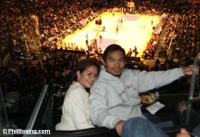 and come on! you're telling me that theres no Filipino in LA who could Manny some better seats than this???